
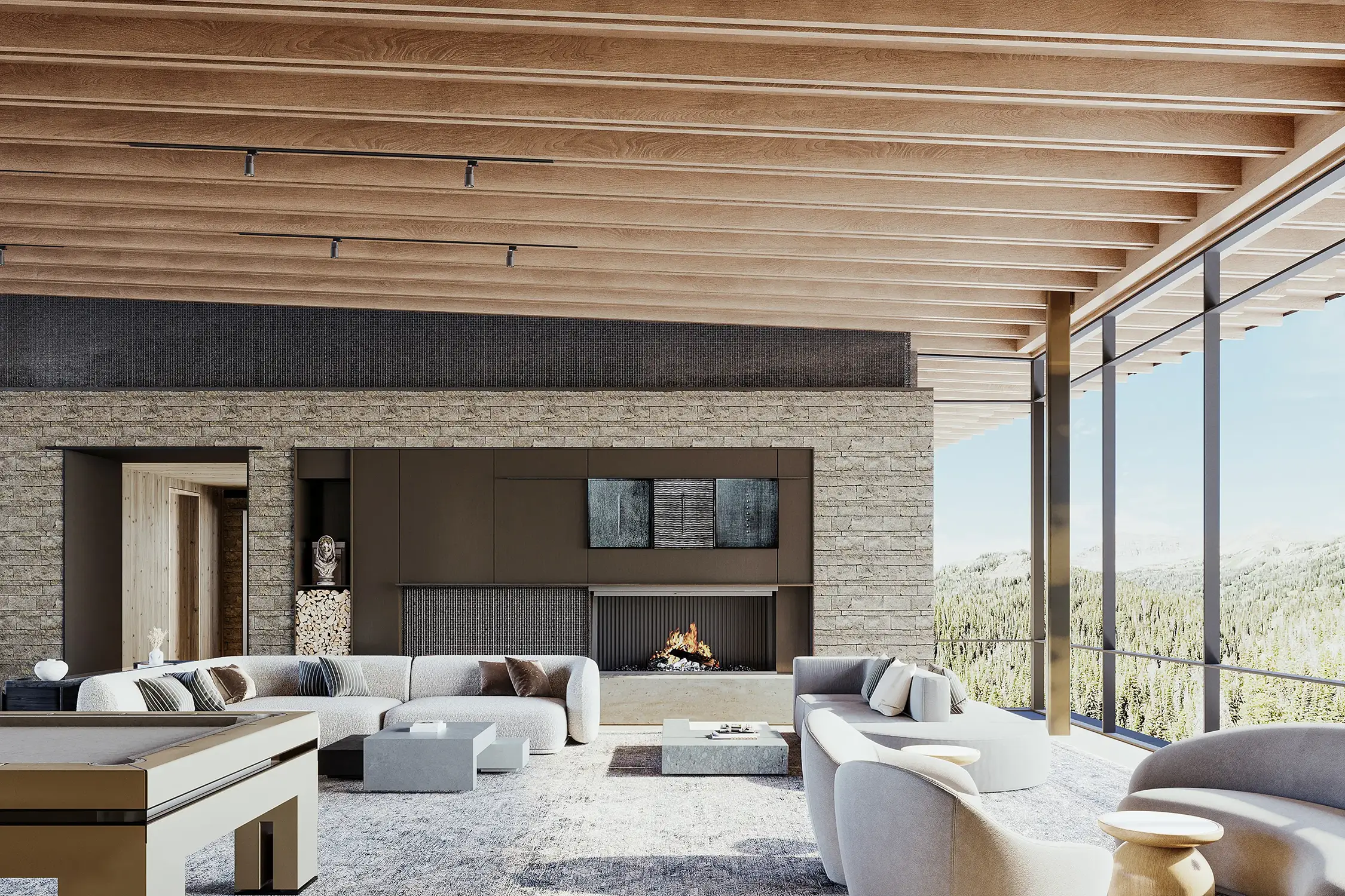
The real problem is a credibility gap
An architecture practice may present finished projects with careful photography, then show an unbuilt project through a flat or obviously computer-generated image. The audience may not know what is technically wrong, but they feel the change in quality immediately.
That gap can make the proposal look less resolved than it really is. Materials feel provisional, scale becomes harder to read, and the project starts asking the viewer to supply too much imagination. The render has not simply failed to look beautiful; it has made the design harder to trust.
Where weak visuals slow a project down
Different audiences bring different doubts. A client wants to understand the room. An approval board needs to read massing and context. An investor wants to see a coherent proposition. A future buyer wants to picture the experience. One generic image rarely answers all four.
Poor visualization adds friction precisely where the project needs confidence. It can lead to vague feedback, repeated explanations, material decisions made from disconnected samples, and marketing that never quite reflects the value of the architecture.
- Design reviews become conversations about what people think they are seeing.
- Premium projects look interchangeable when the setting and architectural idea are not clear.
- Photography and CGI feel like two different brands when their quality and tone do not match.
- Important presentations rely on verbal explanation that the image should already be doing.
What a useful architectural render should do
Photorealism matters, but it is not the whole job. A technically polished image can still be unhelpful if the camera avoids the key relationship, the styling distracts from the architecture, or the atmosphere has nothing to do with the intended audience.
A useful render keeps the design legible and gives the viewer a clear way into it. The camera explains scale and circulation. Light reveals form and material. Landscape and context show where the project belongs. People and objects support the story without turning the image into a catalogue scene.
- Protect the actual design intent rather than replacing it with a familiar luxury look.
- Resolve the question that matters now: approval, alignment, funding, pre-sales, or marketing.
- Stay convincing at presentation and print size, not only as a small social-media image.
- Work as part of one coherent visual set instead of competing with the other views.
High-end does not mean over-polished
The most believable images are rarely the loudest. Perfect lawns, glowing windows, excessive bloom, and spotless materials can make an expensive project feel less real. Small variations, restrained styling, credible weather, and a clear hierarchy usually do more for the architecture.
The goal is not to make every surface dramatic. It is to make the whole proposal feel considered. When the image is doing its job, the viewer notices the project first and the rendering technique second.
Bring visualization in before the final deadline
A visualizer can contribute more when cameras, references, materials, and the audience are discussed before the launch deck is due. Early alignment leaves room to identify missing information, choose the views that actually matter, and use review rounds to make decisions rather than rescue the schedule.
You do not need a perfectly packaged brief. A current model or drawings, a clear milestone, and an honest description of what the images need to achieve are enough to start a useful conversation.